Memotron Mobile: Designing the Home Experience
Removing the friction from everyday capture
Cover image
Founding product designer, responsible for end-to-end experience design
Team
Aravind - Founder & Engineer
Fuzail - Engineer
01/06
Context
02/06
The challenge
As we started exploring the mobile experience, the focus was on making capturing ideas extremely fast and frictionless.
The web app works well for organizing and connecting knowledge, but mobile needed to support quick, in-the-moment capture, often during everyday situations. At the same time, Memotron relies on structures like nodes, collections, and linking, so we couldn’t remove context entirely.
So the challenge was:
How might we make capture immediate, while keeping the system understandable and connected?
03/06
Initial Explorations
I explored how existing tools handle capture on mobile to understand common interaction patterns and trade-offs, and then experimented with different approaches for the home screen.


Early exploration concepts
❇️ Inline capture aligned best with our goal.
Inline capture worked because it let users start immediately. Navigation remained accessible, but was intentionally secondary to keep capture fast.
04/06
Shaping the Home Experience
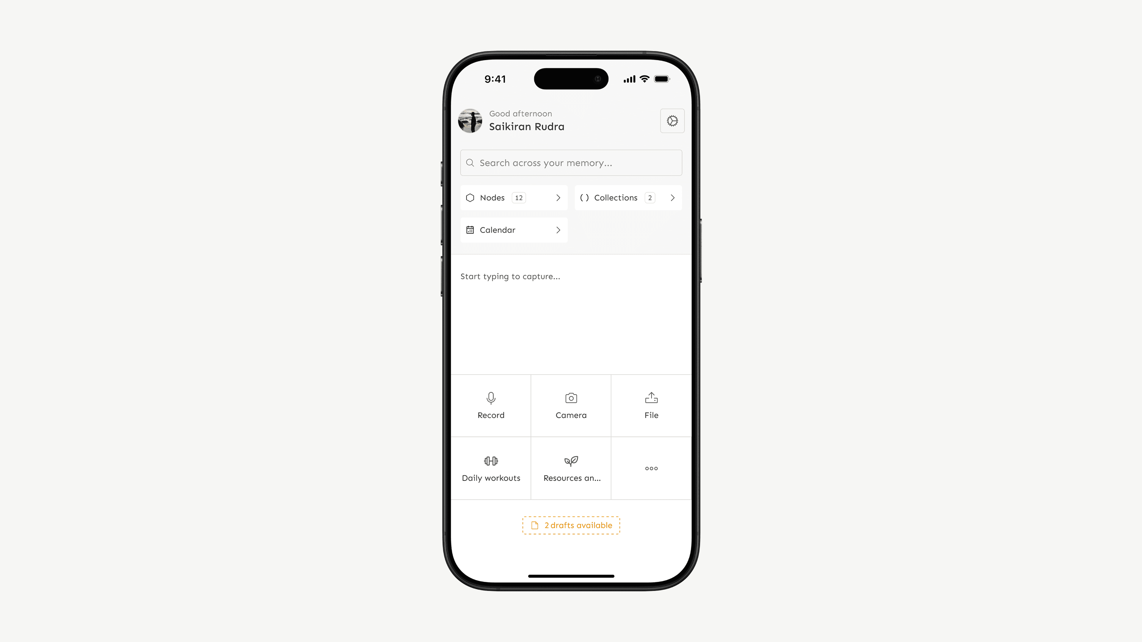
I chose an inline capture-first layout to make capturing immediate while keeping navigation accessible.
The screen is split into two parts: a primary capture area and a secondary navigation section. Around 60% of the space is dedicated to capture, allowing users to start typing or use capture tools instantly, while the remaining space provides access to Nodes, Collections, and Calendar.
The capture area uses a white background to draw focus and signal action, while the navigation sits on a muted grey, keeping it available without competing for attention.

Home screen flow overview
This shifts away from a browsing-heavy home screen, which some users may initially expect. In return, capture becomes immediate, reducing friction significantly. This tradeoff is supported through onboarding and subtle guidance.
Recents were intentionally not surfaced on the home screen. While useful, displaying them would compete with capture and increase cognitive load. Instead, they remain accessible through navigation, keeping the home screen focused.
05/06
Impact
Benchmarked against existing productivity tools, Memotron enabled faster capture and organisation across formats, reducing steps, supporting a wider range of inputs, and keeping capture and navigation directly on the home screen to minimise decision time
At this stage, impact was evaluated by comparing interaction steps and flows against existing tools. Validating this with real usage data remains the next step

Benchmark comparison across capture types
06/06
Reflections
Designing the home screen required moving away from familiar browsing patterns and prioritizing immediate action over browsing. While this introduced a slight learning curve, it made capturing feel more immediate and natural in everyday use.
This project reinforced the importance of reducing interaction cost early and designing around user intent rather than convention, especially in early-stage products where core behaviors are still being defined.